Showing posts with label 4200. Show all posts

November 26, 2012

Another break ends...

...with me leaving most of the work til the last minute. Commendable, to be sure.

The only thing I'm really changing for Sugar Moon is my ad...New tagline (...sortof. TBA.), changed font, different copy... Yeah, it pretty much looks the same. I don't know how I feel about this gross beige background...but how to fix you?! Ahhh


Just finished most of my website and app screens for GSN. Are we supposed to post those? I'm still in NBC mode... Anyway, I guess I'll try to conquer a logo animation. Here's some that I liked that I probably don't have time to figure out:


Liv Id from Plenty on Vimeo.


PlusOne Logo Animation from Sander van Dijk on Vimeo.

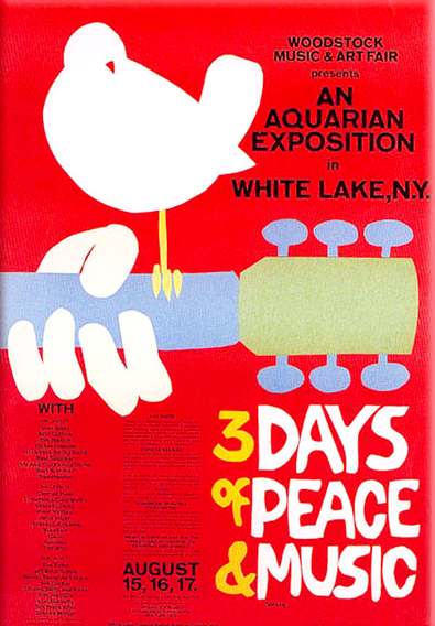
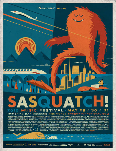
Thoughts on the Atlanta Jewish Music Festival poster:


Looks like I'm going illustrative :}

October 3, 2012

Signage

Sugar Moon signage--I think I'm gonna do a chalkboard menu for inside, a chalkboard lean sign thing for outside, and cupcake ID cards.

My rough, ROUGH stab at the cupcake cards:

Interior Menu:


With some color:


This would be hand-drawn, so it's not meant to be so neat and clean. But, alas, I do not have a chalkboard like this. Really, or the patience to measure and draw everything out. Especially for free.

Some exterior chalkboard signs:


These aren't coming out as detailed as I had imagined, but perhaps this goes with our current brand better? I'm gonna mess with them a bit more though...

September 26, 2012

Uniforms and sketches and signage, oh my

...because blogging is better than Pinterest. Sketches:


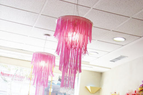
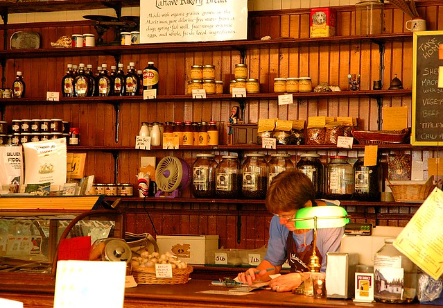
Sugar Moon interiors, uniforms, signage inpiration:


Okay I don't even know why I'm posting these; I don't even think we're doing another store interior...


Publik's (by the Fox Theater)'s interior, which I really like and may copy parts of...


Awesome but unrealistic:


Just because it's awesome: the downstairs interior of wish (a shoe store in little five points):


Uniform inspiration:


Signage inspiration:


September 12, 2012

vintage typography

Here's my logo for Sugar Moon. Some 3d things are maybe happening...I haven't decided. Some mint and gray things are definitely going to occur.


Perhaps I should encase it in some sort of brackets or swirly something? Perhaps it needs more 1890s flourish things? Perhaps I need an initials-only version? Perhaps I need to make friends with Envelope Distort some more?


Business cards:


Some speedy stationary:


Okay somewhere in there this went from vintage back to modern minimalism. I have no idea how that happened...

The lamest cupcake box ever:


I'll do the updates as I finish more stuff. STAY TUNED, LOYAL VIEWERS, for a mental breakdown will likely occur.

September 8, 2012

SUGAR MOON.

Get ready for the biggest post ever. Logo inspiration, sketches, illustrator progress...it's gonna get real.

Sugar Moon logo inspiration...this thing is going to be intensely ornate and crazy.


I'll probably end up making one for when its bigger (on the window, or on take-out boxes) and one thats less crazy for when it's smaller on business cards and stationary. 

Scans of some sketches:


And my sad-looking Illustrator file:


...So it turns out, not the biggest post ever. Alas, wishful thinking.