February 26, 2012

more skate it or hang it logo ideas


A more graphic/typographical approach.  I still like the tribal pattern idea, so I think I'm going to explore that more over the break, but here's where I am right now.

February 20, 2012

skate it or hang it: initial ideas


I'm thinking something graphic. Tribal tattoos, graffiti, and icons/symbols are influencing my design quite a bit. While I'll definitely have a color version, I'm going to focus on the black and white. This exhibit will probably have a huge emphasis on color in the pieces and press kit and other things, so the graphic boldness of a black and white logo will hopefully stand out.

Right now I'm still going through all the obvious solutions, but soon I hope to get past that into the good stuff :)

February 18, 2012

kinetic typography draft


Where I'm at. I still have to add a camera to that last scene, and I'm planning on adding some spot illustrations of guns and cop cars, etc. I'm also looking at video copilot tutorials, and I might add some of that craziness? Ahhh who knows

February 14, 2012

infographic progess

edited crow infographic:


Just a few more things to tweak and I'm calling it done.

EDIT: okay, here's the alleged finished product. moment of truth: purple or no purple? and, if purple, does that mean I have to integrate color into the rest of the brochure/poster/mailer? ...dang it.


CROWS i am so tired of them

Poster:


Brochure:


Infographic (a fold-out page in the brochure):


Postcard:


Here's where I'm at with the TED Talk collateral project. I think the poster is done, I might just play around with the illustration style a little. The brochure is done except for the typography on the vending machine diagram spread and maybe a sleeve to put the whole thing in. I tried to print out a comp of it today, but double-sided pages and booklet printing freaks me out. I'm gonna try to be "done" by the end of class tomorrow (...today?) and then I can run by Kinkos and see if that'll work for me, or if I have to go home and figure something else out. According to Yelp, though, the one downtown is full of bitch employees, and I'm a pretty high maintenance customer... Anyway, the mailer (a postcard, really--mailer seems too involved a name for what I will inevitable end up making) is in the works. I figure it's the easiest one, so I've let it slide a bit. There's going to be a postcard/comment card in the brochure, and I have that one pretty much done, so they'll probably be similar.


February 7, 2012

my life: crows and grooveshark

update on the crows brochure:

I've still only really played with the first couple spreads. I have a plan for the rest though (about Josh Klein, about crows in general via inforgraphic, about the vending machine via IKEA-esque diagrams, and a comment card/postcard slot on the back page), so I'm not completely lost like I was a couple days ago. The poster looks more or less the same right now...I'm playing with the idea of adding in a color. The mailer is still MIA, but once I start on the inforgraphic (hopefully tonight, since it's only 10) that should pull itself together.

Grooveshark:

The more I think about what I could do with this, the more I fall in love with it. I'm thinking about doing a different genre/mood/situation for each spread, which opens up so many possibilities it's ridiculous. My friend Bess also has an impressive vinyl collection, so I can add pictures of that as well. This is also kindof personal/individualistic--who am I to say what music you're supposed to listen to when you're angry or sad? Whatever, I guess I'll throw my opinion in there anyway. I have a whole folder of pictures I'm thinking about adding illustration to (see below), but most of them seem kindof relaxed to me. I need to go take some angry pictures. Maybe I can use color theory instead of subject matter...

My folder of already taken pictures:


A makeshift mood board of the kind of stuff I'm thinking about and being inspired by:


crows

CROWS. Okay, here's my draft of the crow's-feet-writing poster. I don't think it's legible enough yet...I'll have to go in and edit out some extra stuff I guess? I'm thinking about doing a limited color palette (...of just black and white), so that's why this is pretty low-key. I'm hoping that'll make it more bold and graphic, and emphasize the crow aspect. We'll see if it's successful...


These comps keep looking like book covers since I keep not putting other information on there...I have to fix that. I'm also not sold on the "Josh Klein" font... maybe Impact or Helvetica.

Okay, so here's my plan:

Poster: these will be put up first, around the city and colleges, maybe in places where crows congregate, like parks and streetlamp poles, etc? The poster advertises the fictional event of Klein coming to the Civic Center or something to speak about crows and their potential.

Mailer: these go out next, to the general public, especially around the Civic Center and places where the posters were put up. I'm thinking about just doing a folded 8x12 sheet of glossy card stock, with the event information on the front (probably similar to the poster), the postal information on the back, and a brief info-graphic on crows in general and their intelligence compared to other animals, and maybe some stuff about their population.

Brochure: This is a little booklet of information given out at the event with more information about Klein (he has some interviews on his Wordpress) and his other projects, crows and their potential, maybe a summary of the points Klein goes over, etc. I'm thinking it'll be 8 pages (2 folded sheets, front and back), and it'll come in a nice little sleeve. I'm going to try to add some interesting things to it, like a place to put a business card or a postcard, and maybe one of the inside pages will fold out to accommodate a more involved info-graphic or illustration. I think it'll also be about 6x8 inches, and saddle stitched, unless I turn out to have a bunch more information and need to add more pages, and then I'll try to perfect bind it. Here's where I am on that so far (..not much):


I'm thinking about taking pictures of stereotypical urban areas and then pen-tooling some crows in--I think the booklet would get a little boring with 8 pages of black and white, so maybe some photography will break that up.

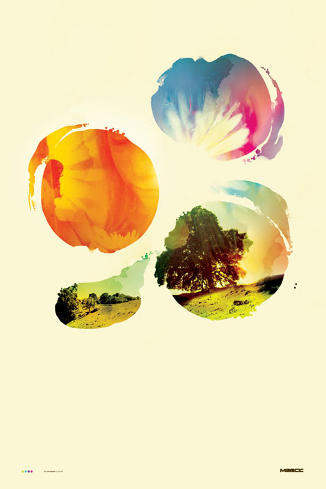
As far as the product brochure goes, I think I'm going to do Grooveshark, and I'm thinking about pairing illustration and typography to convey a mood as related to musical genres or albums. Probably along the lines of a more intense version of this: